


Contents
In option strategy theory, we have a whole bunch of funny expressions.
That is why newcomers often say it is like learning a new language, including the Greeks.
What does “price sitting on top of the ball” mean?
It refers to the curvature of the T+0 curve in the payoff diagram and where the price is in relation to that curve.
Let’s break that statement down and explain the payoff diagram and T+0 line first.
Here is a payoff diagram of an iron condor where the expiration graph is shown in blue.
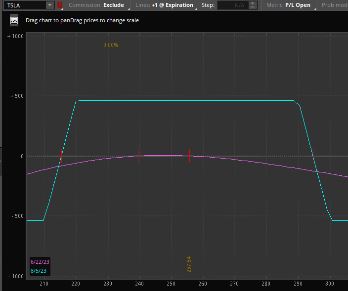
This payoff diagram, also known as the risk graph, is generated by ThinkOrSwim in the analysis tab.
The T+0 line is the curved purple line.
The number at the bottom horizontal axis of the graph is the price of the underlying, which in this case is Tesla. It is currently trading at $257.
The number on the vertical axis on the left shows the P&L (profit and loss) at expiration for a given price of TSLA.
So, for example, if TSLA is at $230 at expiration, then the P&L of the iron condor would be $460.
If TSLA is at $310 at expiration, then the P&L of the trade would be at a loss of -$500.
This is just from reading the blue-colored graph.
T+0 Line
Now that you know what the blue line tells us. Let’s explain what the purple line tells us.
This is the T+0 line. It means current time plus zero days.
Well, the current time plus zero days is right now. Some people will just say today.
That’s why it is sometimes known as the “today line.”
It tells you what the P&L would be today (as opposed to at expiration).
For example, if TSLA moves to $280 today, you would be down roughly $50 from reading the purple line like this:
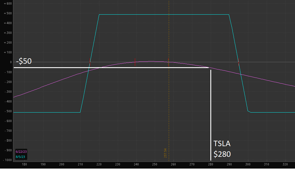
But do you see that the T+0 line is shaped like a ball?
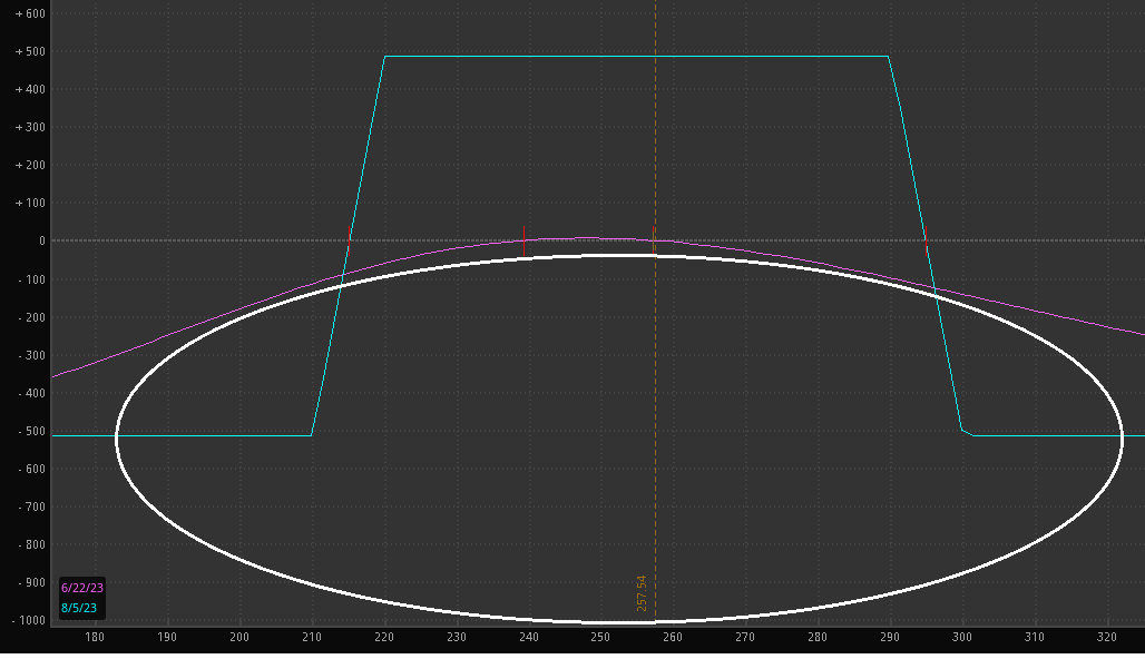
How about now? I’ve drawn a white squashed ball underneath the T+0 line.
Another Example
Different software may display the payoff diagram differently. Here is the payoff graph as displayed by OptionNet Explorer for a double calendar options strategy:
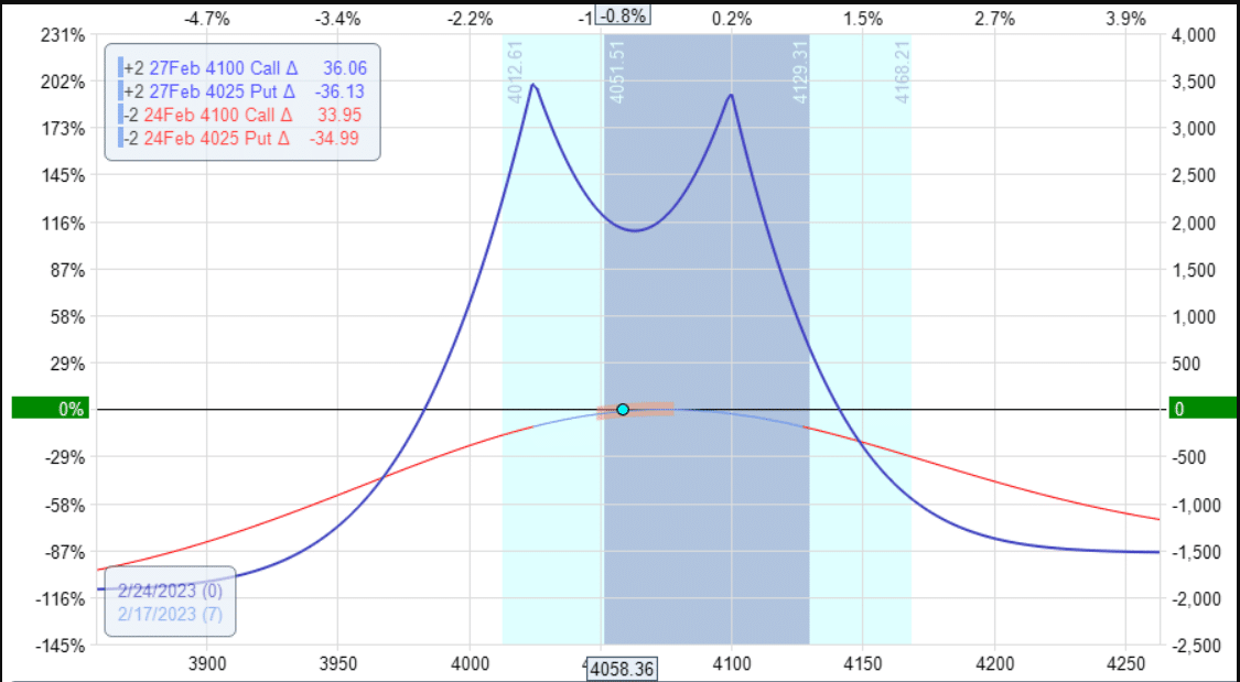
The underlying price (in this case, SPX) is always shown as the bottom horizontal axis numbers.
However, this time the P&L is shown on the right-hand vertical axis.
You read the graph the same way.
The blue line is the expiration graph – although it is curvy, unlike the straight lines of the iron condor.
The T+0 line is the red curved line on which the dot sits.
Do you see the ball?
Most income-style options strategies have this particular curvature of the T+0 line.
These strategies are ones where you do not want to price to move too far to the left or too far to the right. You just want the price to sit there.
In particular, you like for the price to sit right on top of the ball.
Butterfly Example
Here is an example of a butterfly strategy on SPX.
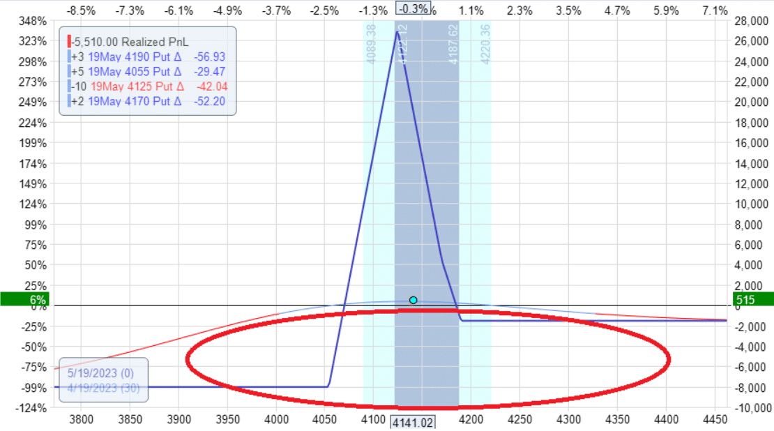
The P&L is showing a positive $515 for this trade.
Remember, it is possible (although not particularly likely) for SPX to move 100 points in a single day.
What if tomorrow, the price moved from the current price of 4140 to 4040?
You can see from the T+0 line (below) that you would lose the entire $500 profit.
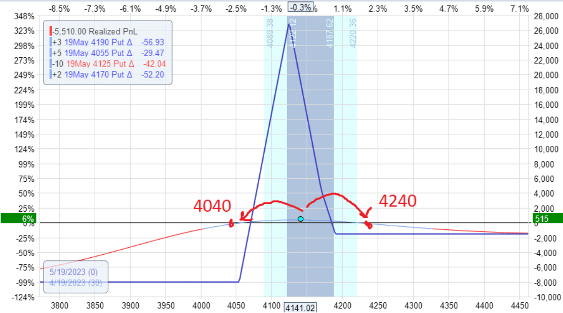
If it moved up 100 points from 4140 to 4240, you also would lose $500 worth of profit.
Because the price dot is above the ball, the T+0 slants downward on either side.
That means that if the price moves up or down tomorrow by a significant amount, it is likely that P&L will drop.
But if the price moves just a little and that extra day of theta income is greater than the amount lost by the price movement, we can have a P&L increase tomorrow.
Delta On Both Sides Of The Ball
Next, we see TSLA with the price dot sitting on top of the ball for a double calendar trade:
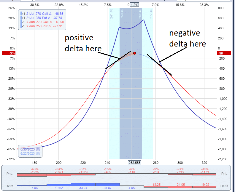
I have turned on the delta histogram display at the bottom of the graph.
You see that on the left side of the ball, the delta is positive (because the histogram is blue).
The histogram is red on the right side of the ball, meaning that the delta is negative there.
The option Greek delta tells you the slope of the T+0 curve.
If it is sloping up, as in the case on the left side of the ball, then delta is positive.
If the curve is sloping down on the left side of the ball, then delta is negative.
When delta is positive, the trade benefits if the underlying price increases.
When delta is negative, the trade benefits if the price goes down.
You don’t want the price to go up or down in a non-directional strategy such as the double calendar or the iron condor.
You want delta to be flat (or as close to zero as possible).
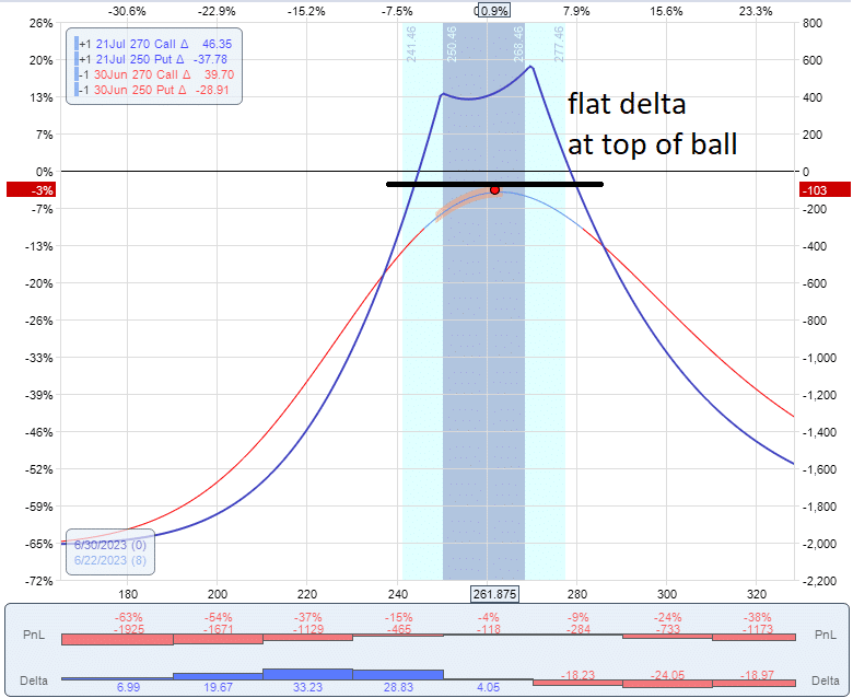
You want a flat delta with the price sitting on top of the ball.
Conclusion
So now you know what is meant when people say, “Price is sitting on top of the ball.”
It applies to income-style trades where the curved T+0 line forms the top of a ball.
Therefore, we don’t want the price to move too far to the left or to the right.
Otherwise, it would slide off the ball and lose our profits.
In this introductory article, I wasn’t going to get into the advanced Greeks, such as gamma.
But here is something for those who have heard of gamma.
The dome shape of the T+0 line is characteristic of trades with negative gamma, which most income trades have.
The iron condor, the double calendar, and the broken-wing butterfly all have negative gamma.
Negative gamma means that the trade wants the price to not move too much.
In contrast, positive gamma means that the trade will benefit from a big price move.
We hope you enjoyed this article.
If you have any questions, please send an email or leave a comment below.
Trade safe!
Disclaimer: The information above is for educational purposes only and should not be treated as investment advice. The strategy presented would not be suitable for investors who are not familiar with exchange traded options. Any readers interested in this strategy should do their own research and seek advice from a licensed financial adviser.


Great explanation of how income strategies look during the life of the options. The ability to see price movement and how it affects P&L is difficult, but this article clarified it quite a bit. Thanks!