


Some traders watch the daily charts because they are swing traders who don’t want to wait too long to complete a trade.
Some traders prefer to watch the weekly charts because of less noise of price movements and more predictable patterns.
Then, traders use multi-time frame analysis to watch both charts.
Did you know that commonly used moving averages on the daily charts match up with another set of moving averages in the weekly chart?
And vice versa.
Contents
Moving Averages
There are two common types of moving averages –simple moving averages and exponential moving averages.
For the purposes of the examples in this article, we will only be using the simple moving averages (MA).
A 20-period simple moving average is the average of the closing prices for the last 20 candlesticks on the chart.
If the chart is a daily chart where each candlestick represents a trading day, then it would be called a 20-day simple moving average.
If the chart is a weekly chart where each candlestick represents a trading week, then it would be called a 20-week simple moving average.
The exponential moving average (which we will not get into here) uses a variation of the formula where the more recent candles are given greater weight in computing the averages.
Moving Averages On The Daily Chart
Here is a daily chart of Cisco Systems (CSCO) with a 20-day (green line), 50-day (blue line), and 200-day (red line) moving average – which are very commonly used moving averages.
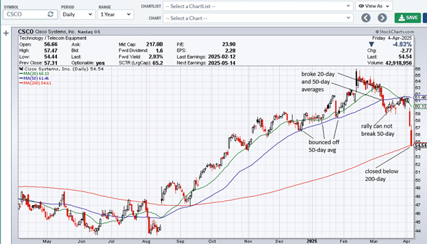
Note the various chart landmarks where the price action interacted with the moving averages.
Moving Averages On The Weekly Chart
Now we look at the CSCO weekly chart:
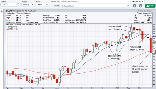
This time, we have overlaid the 4-week (green line), 10-week (blue line), and 40-week (red line) moving averages on the weekly chart.
You can see how the same chart landmarks interact with the moving averages at the same places.
This is because:
A 20-day simple moving average on the daily chart is the same as a 4-week moving average on the weekly chart.
A 50-day simple moving average on the daily chart is the same as the 10-week moving average on the weekly chart.
A 200-day simple moving average on the daily chart is the same as the 40-week moving average on the weekly chart.
Practical Application: 200-Day Moving Average
Many investors, including institutional investors, use the 200-day moving average as the line in the sand to categorize a stock as bullish or bearish, depending on whether it is above or below the 200-day moving average.
An investor on a weekly chart can see this line in the sand by watching the 40-week moving average.
Joe Rabil, author of Invest Like a Pro, likes to use the 18-period and the 40-period moving averages and sometimes the 4-period moving average.
He uses multi-timeframe analysis, simultaneously looking at the monthly, weekly, and daily charts.
On the weekly chart, he might notice that the financial section (XLF) fell below the 40-week moving average.
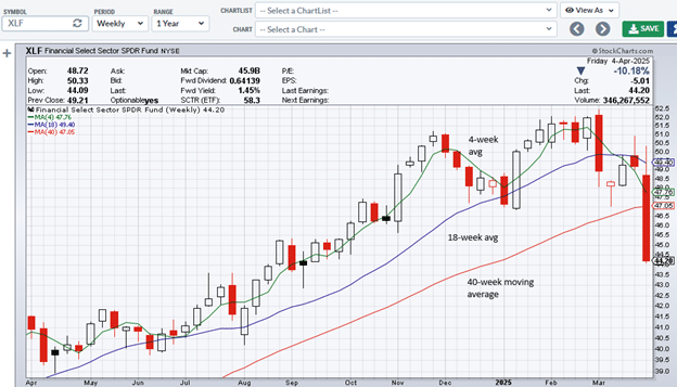
He automatically knows that it broke the 200-day moving average on the daily chart even though he doesn’t have the 200-day moving average plotted.
But for us, let’s just take a look at the daily chart with the 200-day moving average in place:
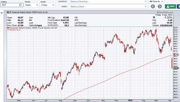
Yep, it sure did.
Therefore, if a stock crosses the 40-week moving average on the weekly chart, it is crossing the all-important 200-day moving average on the daily chart.
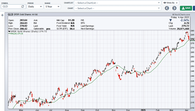
The 20-Day Is The Same As The 4-Week
If gold (GLD) is riding above the 4-week moving average on the weekly chart:
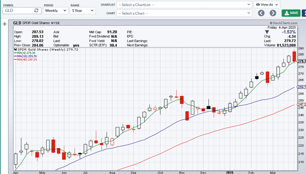
Then it would be riding above the 20-day moving average on the daily chart:
The 100-Period On The Daily Is The Same As The 20-Period On The Weekly
Let’s say that an investor is looking for a stock above its 20-period MA on the daily and weekly charts.
He could flip back and forth between the daily and weekly charts.
Or he can use a charting platform that supports multiple chart views.
Alternatively, just put a 20-day moving average (green line) and a 100-day moving average (blue line) on the daily chart:
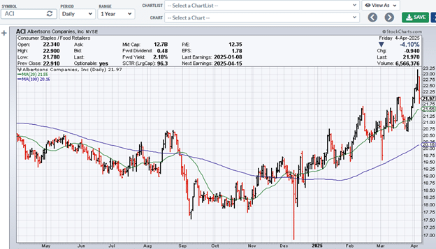
So here, Albertson (ACI) is above both its 20-day moving average and its 20-week moving average because the blue line is equivalent to what you would see as the 20-period moving average on the weekly chart.
To confirm, below is the weekly chart with the 20-week moving average plotted.
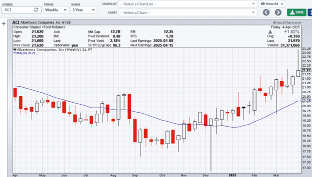
Theoretically, the blue line in the daily and weekly charts should match.
However, we see from the low tick of March 4th, 2025, that it does not touch the blue line on the daily chart, whereas it does touch the blue line on the weekly chart.
The low tick of the candle is correct.
The moving average lines are slightly off.
This is due to the difference in the granularity of the input data. The daily chart is using 100 data points to compute its average.
The weekly chart is using only 20 data points.
However, the two lines should be close enough for most practical purposes.
The 150-Day Is The Same As The 30-week
In Stan Weinstein’s Stage Analysis Model Book. he recommends the use of the 50-day, 150-day, and 200-day moving averages to identify the four stages of a price cycle.
These moving averages match nicely with the 10-week, 30-week, and 40-week moving averages on the weekly chart.
Here is the daily chart of Merck (MRK) with its 150-day moving average…
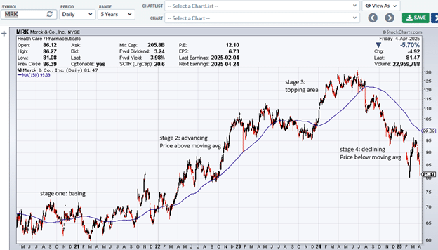
Note the price relationship to the moving average in each of the four stages.
A person using a weekly chart will see the same pattern with the 30-week moving average:
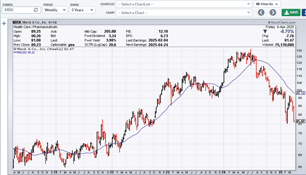
If we didn’t look at the daily/weekly label in the chart, we wouldn’t have been able to tell the difference.
The Math
A 20-day MA averages the last 20 candles on the daily chart.
On the weekly chart, those 20 candles will become four because there are five trading days inside one weekly candle.
Therefore, a 20-day moving average is the same as a 4-week moving average.
Similarly, a 200-day moving average is the same as a 40-week moving average because 200 divided by 5 is 40.
Since 150 divided by 5 equals 30, the 150-day moving average is equivalent to the 30-week moving average.
A 10-period moving average on a weekly chart is the same as the 50-day moving average on a daily chart because there are 50 trading days in the period of 10 weeks.
In Summary
20-day MA = 4-week MA
40-day MA = 8-week MA
50-day MA = 10-week MA
100-day MA = 20-week MA
150-day MA = 30-week MA
200-day MA = 40-week MA
These numbers are obtained by dividing by 5 since there are five trading days in one trading week.
Don’t use seven calendar days because the charts don’t draw candles for Saturdays and Sundays.
We hope you enjoyed this article on moving averages in multiple timeframes.
If you have any questions, send an email or leave a comment below.
Trade safe!
Disclaimer: The information above is for educational purposes only and should not be treated as investment advice. The strategy presented would not be suitable for investors who are not familiar with exchange traded options. Any readers interested in this strategy should do their own research and seek advice from a licensed financial adviser.