


Contents
This introductory article gives you the full details on how to read options payoff diagrams, specifically the short put diagram.
These diagrams are also known as risk graphs, P&L graphs, or option expiration graphs.
Being able to read them properly is essential in trading options, figuring out when to exit, and evaluating adjustments.
OptionNet Explorer Example
We will start with the graph of a simple short put.
Suppose we sold a short put on SPY at the 390-strike for the June 21, 2022 expiration, which is 25 days away.
Date: May 27, 2022
Price: SPY @ $412
Sell one June 21, 2022 SPY $390 @ $3.67
Net Credit: $366.50
The short strike was out-of-the-money at around the 21-delta.
And we received $366.50 for selling one contract.
Here is what the payoff graph looks like at the start of the trade on May 27.
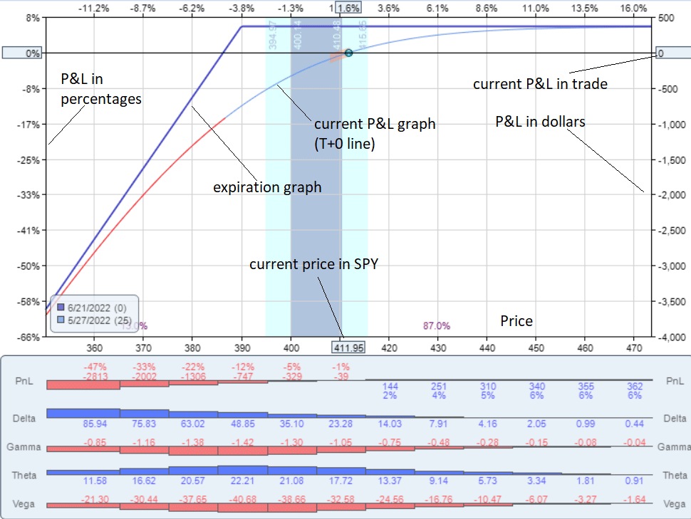
source: OptionNet Explorer
This graph was rendered from OptionNet Explorer.
The bottom horizontal axis is always the price of the underlying.
Right now, the graph shows that the price of one share of SPY is $411.95.
It shows the trade’s P&L (profit and loss) on the vertical axis.
Since this is at the start of the trade, the P&L shows $0 on the right axis.
And 0% gain on the left axis.
The blue dot is where the trade is currently in terms of P&L and the underlying price.
The blue line is the expiration graph.
It shows what the trade will make or lose at the contract’s expiration.
The exact number will show up if you hover the cursor over the line.
As per the graph, the trade will make $366.50 if the price of SPY is above $390 at expiration.
If the price of SPY is at $380 on expiration, then the trade will lose about $700 if you follow the blue expiration graph line.
The All Important T+0 Line
The curved line is the current P&L graph as of today. It is also known as the T+0 line.
It shows that if SPY moves to $420 today, the P&L will be up $200 — not the $366.50 that it would be if it was expiration day.
The P&L curve changes over time in the trade.
Many software will predict an estimated P&L curve line X number of days in the future.
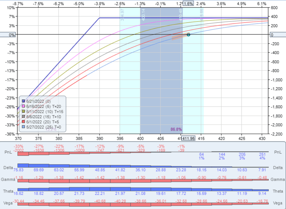
The red line here is the T+5 line which shows what the P&L curve would be if it was five days from now.
These lines are only an estimate since these lines are affected by the implied volatility of the option (which can not be known in advance).
Interactive Brokers Example
Here is the payoff diagram of a short put on the stock Coca-Cola (KO) as drawn by Interactive Brokers…
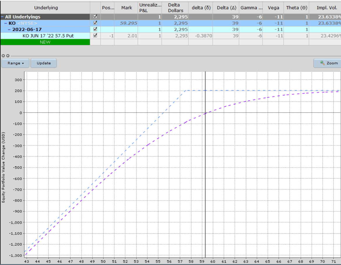
As is typical, the P&L in dollars is shown on the left vertical axis, with the price of Coca-Cola shown on the bottom horizontal.
It also shows the current Greeks of the position in the table above, plus a few other metrics such as implied volatility and Delta Dollars.
ThinkOrSwim Example
The ThinkOrSwim software calls it the “Risk Profile,” which you can see in its Analyze tab. Here we see a short put on Tesla (TSLA).
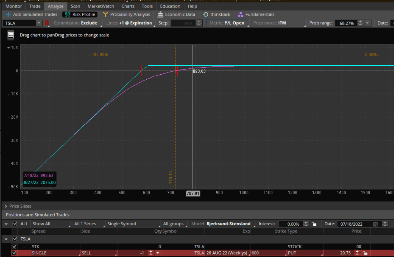
The exact P&L value on the graph is displayed in the lower left as you move the cursor left or right over the range of Tesla prices.
The “Date” field lets you advance the calendar to see what the magenta curved P&L line would be if projected to that date.
If you want to know the current Greek as well as how it changes across the different prices, change the “Metric” tab to the Greek of your choice, and ThinkOrSwim will plot it out for you.
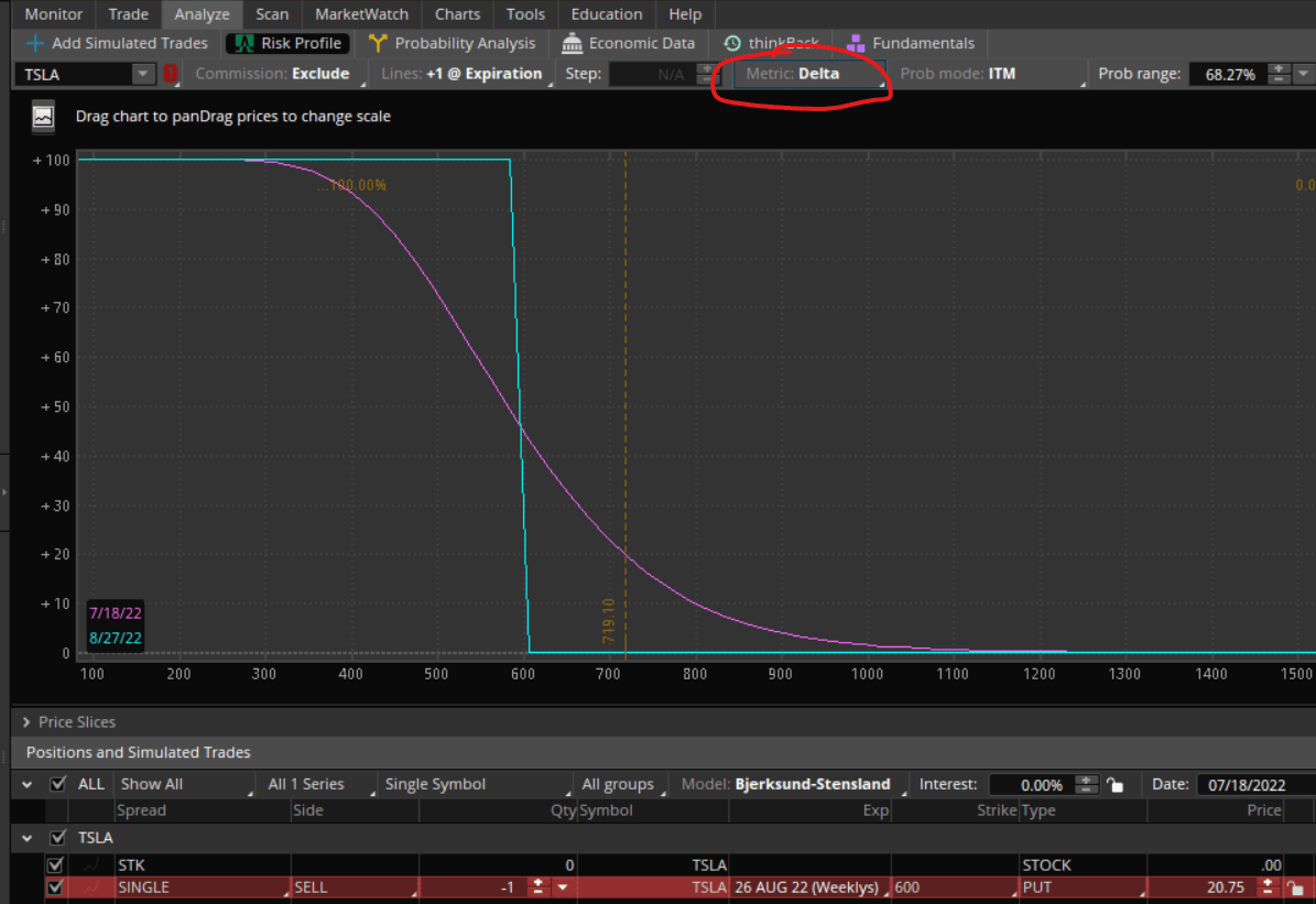
Using the date calendar, you can even project forward in time what the Greek will look like on that date.
TastyWorks
The same thing can be done in TastyWorks, but its user interface is a bit different.
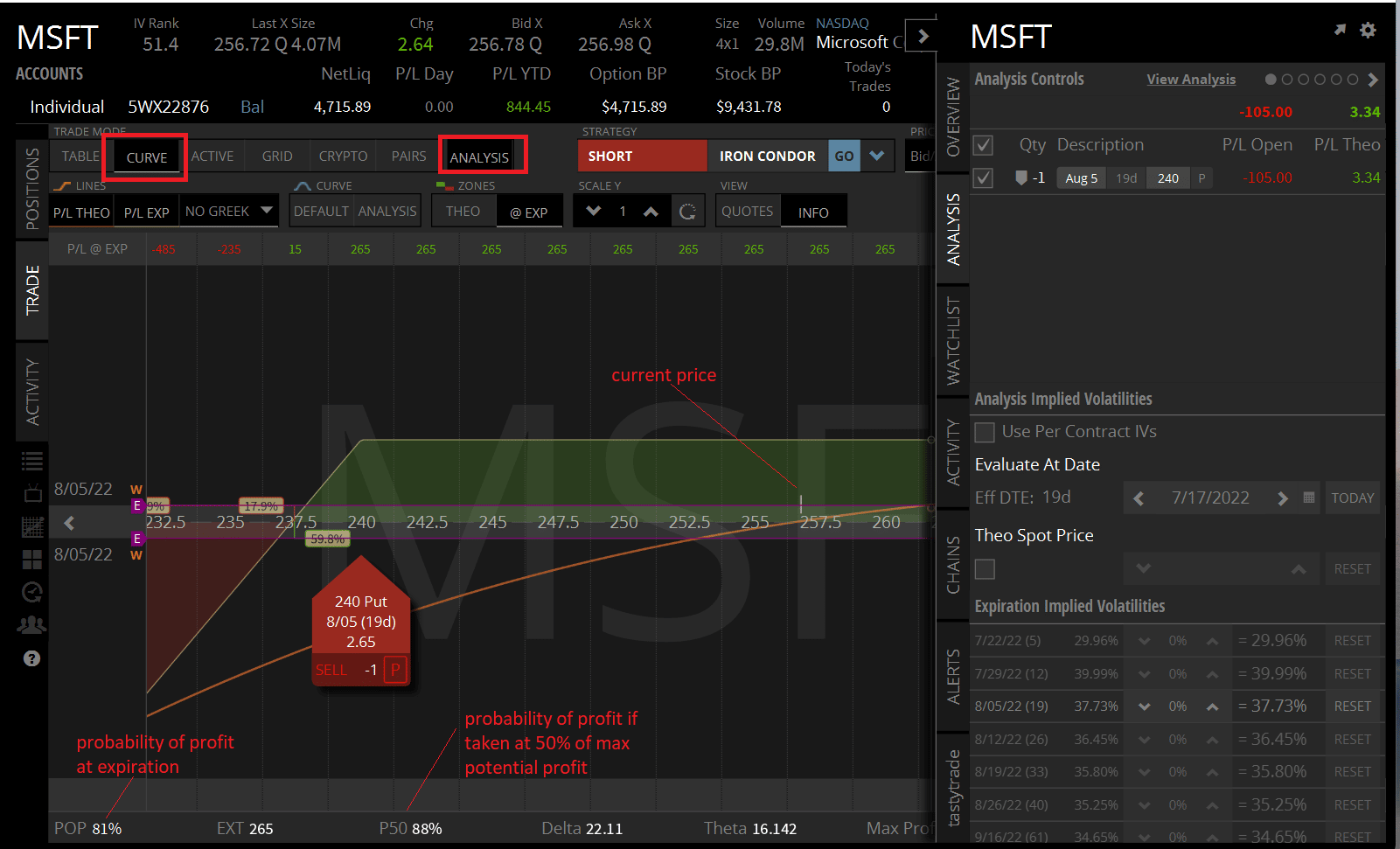
This is showing a short put on Microsoft (MSFT) if you switch to “Curve” mode and turn on “Analysis.”
TastyWorks shows something called “POP,” which is the probability of the trade being profitable if held to expiration. Profitable means that the trade wins at least one penny or more.
It also shows “P50”, which is the probability of the trade being profitable if it was taken off as soon as 50% of the maximum potential profit is achieved.
OptionStrat
Here is how OptionStrat displays a short put on IWM (Russell 2000 ETF):
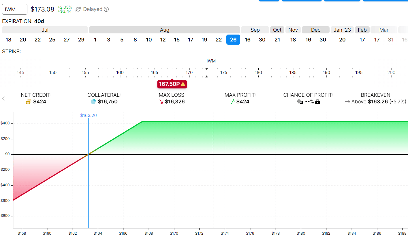
The blue vertical line shown as $163.26 is the price at expiration that IWM has to be above in order for the trade to be profitable.
This is known as the break-even price.
The black dotted vertical line is where the price of IWM is currently at.
OptionStrat can display P&Ls in table form.
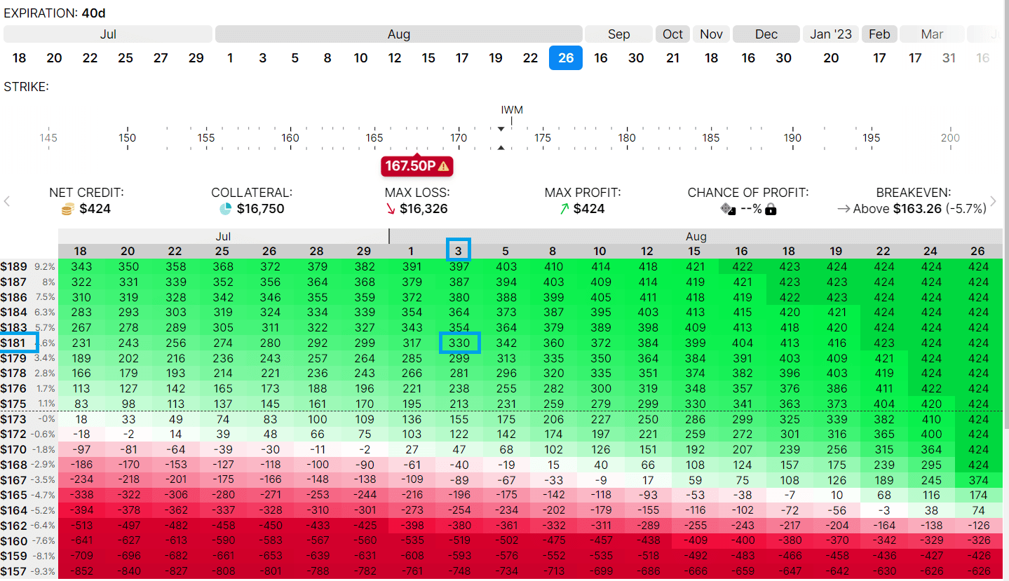
It tells you what is the P&L of the trade at a given date (across the top of the table) and at a given price (vertical column) of the underlying.
For example, if IWM is at $181 on August 3, the trade will be in profit by $330 (as estimated).
FAQs
Why do I see some expiration graphs with curved lines?
In our example of a short put, all the expiration graph consists of straight lines as if drawn by a ruler.
Sometimes, you will see curved expiration graphs as in a calendar trade or a diagonal options strategy.
This occurs in a multi-leg option strategy where some legs are in one expiration, and other legs are in a different expiration.
Does the T+0 line coincide with the expiration line at expiration?
Yes, as time gets closer and closer to expiration, the T+0 line will morph its shape closer and closer to that of the expiration line.
Why do they call it the T+0 line?
It means the current time plus zero days in the future.
So a T+5 line is the current time plus five days in the future.
It would be the estimated P&L curve five days from now.
Conclusion
This article has shown you how to read an options payoff graph across several different platforms.
Each software displays things a bit differently.
And each has its unique features that one may need to get used to.
However, the concept of reading the risk graph of an options trade is the same.
You basically want to know what the P&L is at expiration if the underlying falls on certain prices.
By looking at the graph, you can see what your max potential profit is and what is your max potential risk.
We hope you enjoyed this article on how to read a short put diagram.
If you have any questions, please send an email or leave a comment below.
Trade safe!
Disclaimer: The information above is for educational purposes only and should not be treated as investment advice. The strategy presented would not be suitable for investors who are not familiar with exchange traded options. Any readers interested in this strategy should do their own research and seek advice from a licensed financial adviser.