


The bullish hammer candlestick pattern is a single-candle reversal pattern.
Like all candlestick patterns, it cannot be used in isolation.
If an investor simply buys every time there is a bullish hammer, it will not be successful.
The bullish hammer pattern only becomes meaningful under certain scenarios in the overall chart.
We will look at these scenarios and you will learn the sentiment of the investors that causes this pattern to form.
Contents
- The Bullish Hammer
- In Combination With Other Technicals
- The Hanging Man
- How The Bullish Hammer Is Formed
- Using FINVIZ To Scan For Hammer Candlesticks
- Conclusion
The Bullish Hammer
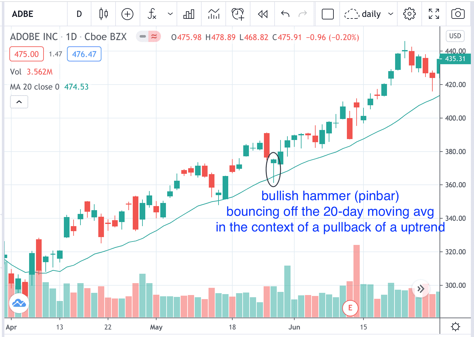
This is an example of a bullish hammer candle on a daily chart of ADBE.
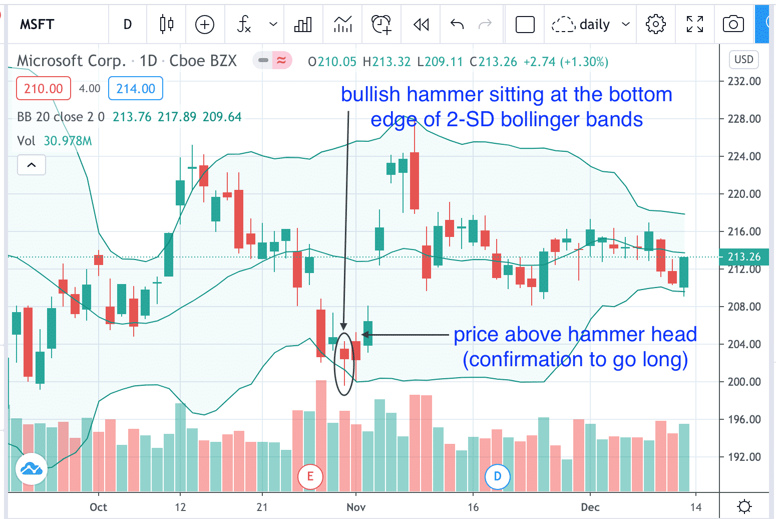
This is another bullish hammer seen on MSFT.
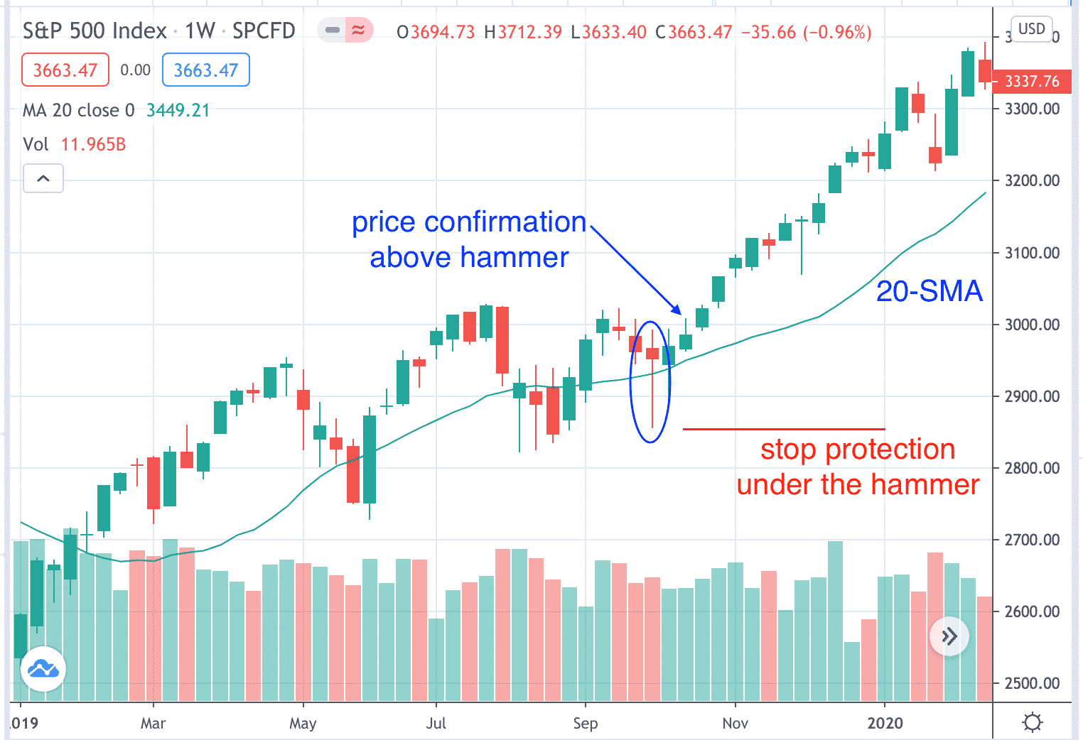
This is an example of a bullish hammer candle on a weekly chart of the S&P Index.
Note that a bullish hammer can be either red or green.
The candle can either be an up candle (the close price is higher than the open price) or a down down candle (the close is lower than the open).
It is the shape of the candle that matters.
The long bottom tail wick.
The small body.
And little or no wick on top of the candle.
While the precise dimensions are subjective, most investors will require that the bottom wick be at least twice as long as the body.
If the wick is exceptionally long as in the case of ADBE above where the wick is 4 to 5 times longer than the body, then it looks more like a pin rather than hammer.
Other names for the bullish hammer is the “pinbar” and “bottoming tail candle”.
Note that the bullish hammer always appears in the context of a downtrend or a pullback in a uptrend (which is a short-term downtrend).
This candle suggests a possible price reversal.
Because the probability of reversal is not overwhelming, most investors will require a price confirmation before acting on the pattern.
Once such confirmation could be if price goes above the head of the hammer, then go long.
The hammer pattern is applicable on any timeframe — be it a daily chart, a weekly chart, a monthly chart, or a 2-minute chart.
As seen in the above three charts, once price confirmation above the hammer has occurred, the stock rallies and off it goes.
In Combination With Other Technicals
The bullish hammer pattern will result in a greater probability of a move up if it occurs in conjunction with another technical chart pattern.
In the ADBE and SPX examples above, the bullish hammer indicated a reversal at the same time that the stock bounced off the 20-day moving average.
The bullish hammer appeared as the stock was making a pullback in an uptrend.
An investor may want to “buy the dip” or “buy the pullback” upon price confirmation when price breaks above the head of the bullish hammer.
For protection, the investor puts a stop loss at the bottom of the hammer.
In the MSFT example above, the bullish hammer indicated a reversal at the same time that the stock reversed from hitting the bottom of a 2 standard-deviation Bollinger band.
The bullish hammer appeared when the stock is at an extreme low — two-standard deviations below the 20-day moving average.
The investor expects a “reversion to the mean” and goes long if price breaks above the head of the bullish hammer and starts to head back up to the moving average.
Here is a bullish hammer in Caterpillar that foreshadowed the reversal of its downtrend.
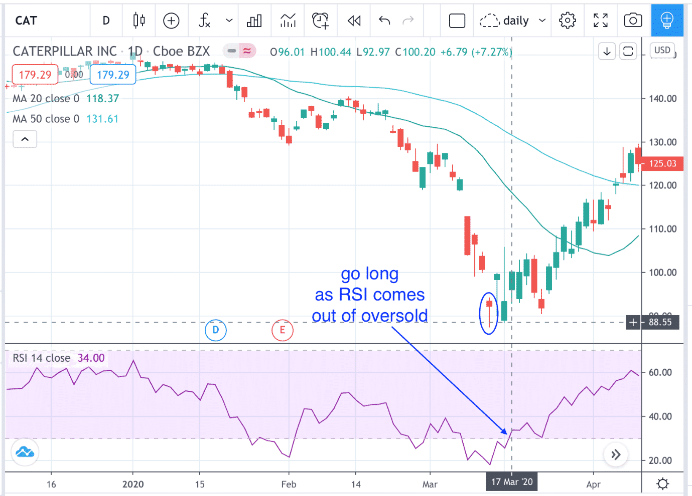
While buying as price breaks above the hammer would have worked in this case, an investor who would like greater confirmation would also have waited until RSI comes out of oversold before going long.
This is because oversold stocks can remain oversold for some time.
The location of the hammer is very important.
The Hanging Man
The following is NOT a bullish hammer, because the location is wrong.

It is a bearish hammer, or better known as the hanging man pattern.
While the shape of the candle is identical to that of a bullish hammer, the sentiment is completely different because the candle appears during an uptrend.
Interestingly, the hanging man on ZM appeared on November 30, 2020 when earnings is to report after the market close.
This indicated bearish sentiment.
And the next trading day after the earnings reported, the stock gapped down.
Why is a hammer in a downtrend bullish and the same hammer in a uptrend bearish?
For that, we have to understand how the hammer is formed.
How The Bullish Hammer Is Formed
Consider a bullish hammer forming in an existing downtrend.
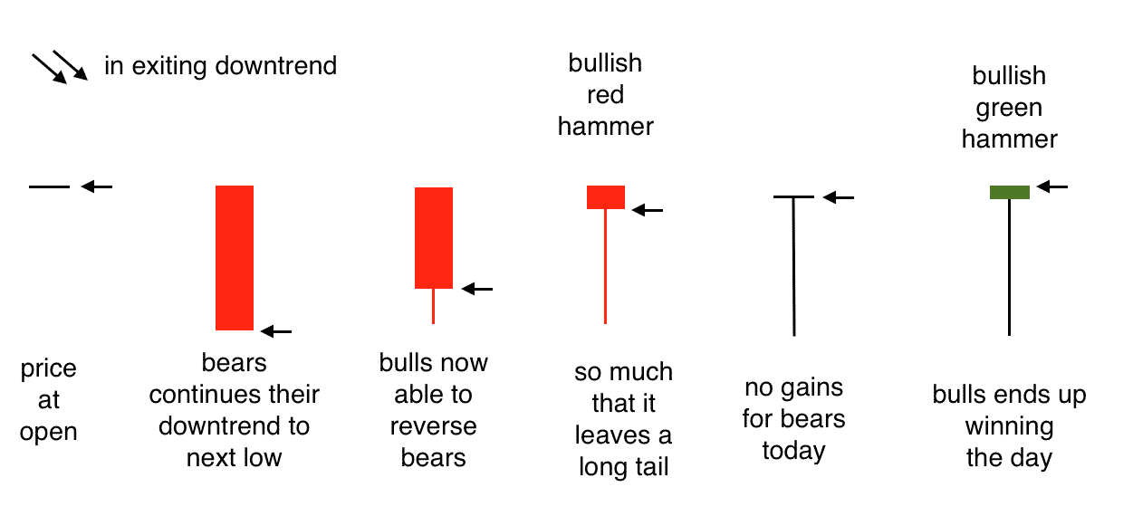
Here the bears are testing new lows.
But the test failed because the bulls was able to push the price back up.
This causes the bottoming tail to form.
The tail indicates “price rejection” of those prices covered by the tail.
The longer the tail, the stronger the price rejection and hence more bullish the candle.
In this case, the bulls were able to push even further up past the open, forming the green hammer candle.
This is why some would argue that a green hammer is slightly more bullish than a red hammer, with all other things being equal.
However, we feel that the length of the tail in comparison to the body is a greater indication of bullishness.
Plus the shortness of the top wick.
However, the psychology of a hanging man forming in an existing uptrend is different…
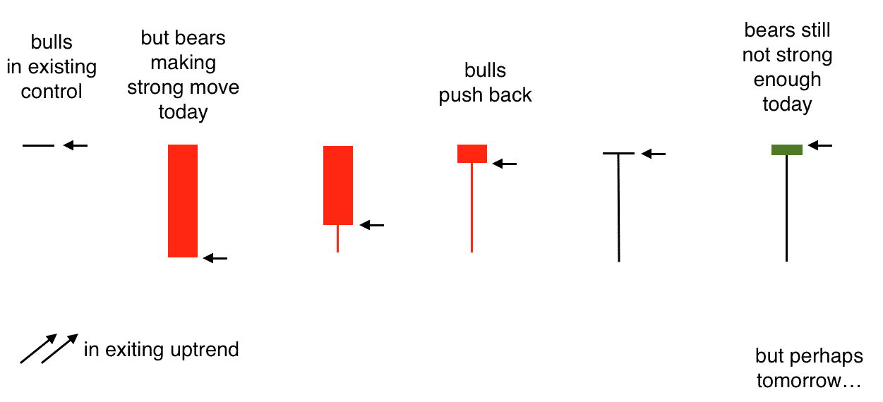
Here the bulls are in existing control of the uptrend.
However, the strong long red intraday candle shows that the bears are picking up strength.
While the strength is still not strong enough to overcome the bulls today, it foreshadows that perhaps soon, the bears will gain enough strength.
Again, the longer the candle, the stronger this sentiment is.
Here the red hanging man is more bearish than the green hanging man, with all other things like the tail length being equal.
Using FINVIZ To Scan For Hammer Candlesticks
My favorite tool for scanner for candlestick chart patterns in FINVIZ.
You can read my full review here, but if you go to the Screener tab and filter for Market Cap. = Mega and Candlestick = Hammer you can then find a list of stocks that meet the criteria.
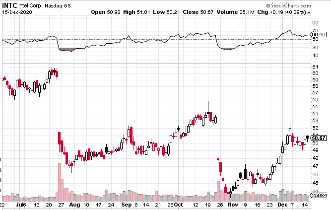
Here is a scan from December 15th, 2020 showing that INTC is the only stock in the screener.
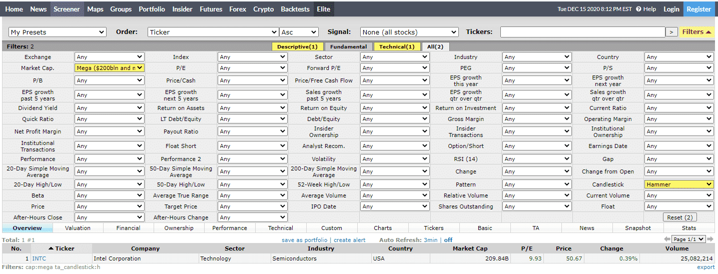
Looking at the INTC chart, we can see that the bullish hammer candlestick shows promise but perhaps the wick is a little small, relative to the body.
Conclusion
The bullish hammer cannot be used in isolation.
It is only bullish if seen in the context of a downtrend.
It is a reversal pattern.
Use in conjunction with other chart technicals.
The longer the tail, the better.
Trade safe!
Disclaimer: The information above is for educational purposes only and should not be treated as investment advice. The strategy presented would not be suitable for investors who are not familiar with exchange traded options. Any readers interested in this strategy should do their own research and seek advice from a licensed financial adviser.