





Market breadth indicates the underlying health of the broader market by looking at the number of stocks that are performing well.
There are many ways to measure market breadth.
We had talked previously about one of our favorite ways of measuring market breadth is by the percentage of S&P 500 stocks that are above their 50 day moving average – or above the 200-day moving average is also very common.
Other ways include Advance/Decline lines and ratio, new highs/lows, up/down volume, etc.
Today, we are looking at a lesser known breadth indicator known as the S&P 500 Bullish Percent Index as indicated by ticker symbol $BPSPX on StockCharts.
The S&P 500 Bullish Percent Index is calculated from the percentage of S&P 500 stocks that are currently showing a buy signal on their point-and-figure charts.
A stock is considered to be on a buy signal when its point-and-figure chart forms a column of X’s that rises above the previous column of X’s.
Point-and-figure charts remove time and noise.
The horizontal axis does not represent days or time at all.
Instead, the chart is built solely from price movements.
X’s represent bullish price advances, while O’s represent bearish declines.
A column of X’s indicates an uptrend, and a column of O’s indicates a downtrend.
It only records meaningful price changes, so small fluctuations and market noise are automatically filtered out.
Another advantage is that these signals are simple for computers to calculate, which is one reason the Bullish Percent Index can be computed efficiently across all 500 stocks in the index.
Contents
- Bullish Point-And-Figure Signal
- Divergences In Breadth Indicator
- Sector Bullish Percent Indices
- How To Use The Bullish Percent Index In Practice
- Using The BPI As An Options Income Filter
- FAQ
- Conclusion
Bullish Point-And-Figure Signal
Here is Apple (AAPL) showing a bullish buy signal…
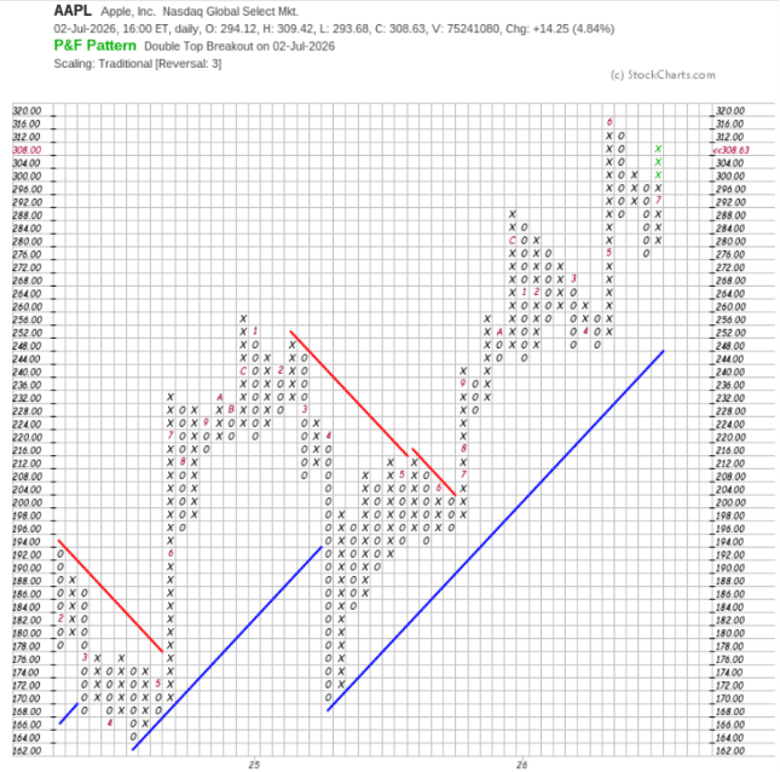
Source: StockCharts
StockCharts does a good job drawing point-and-figure charts.
And its “SCC Default” settings work well.
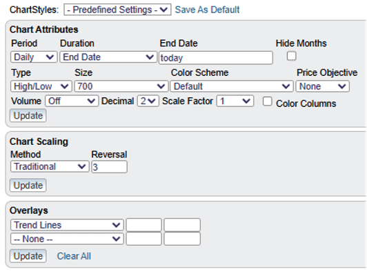
The blue and red trendlines are automatically drawn.
The below chart is Oracle (ORCL) showing a sell signal – column of O’s lower than previous column of O’s…
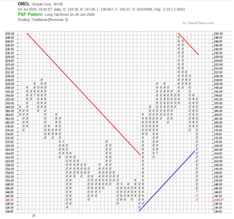
We also note that the last column of O’s broke down below the blue uptrend line.
Do this for all 500 stocks in the S&P 500 and you get the percentage of bullish stocks.
Right now the Bullish Percent Index is at 62%.
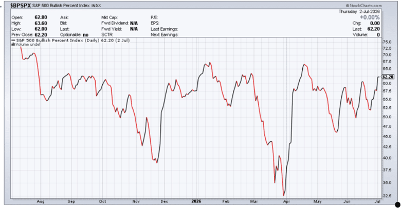
Source: StockCharts with symbol $BPSPX
This compares similarly with the percentage of S&P 500 stocks above its 50-day moving average showing 67%
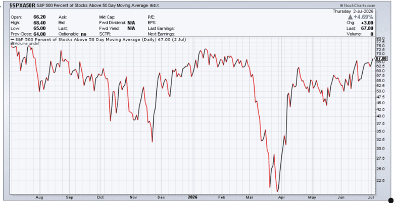
Source: StockCharts with symbol $SPXA50R
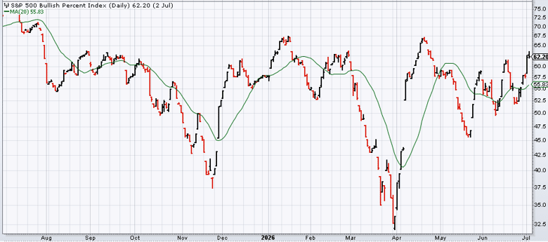
And you can see from both graphs that they are in generally in good agreement most of the time.
If you apply a 20-day simple moving average to the chart, then you can see better which direction the bullish percent index is trending…
Divergences In Breadth Indicator
Divergences are where the BPI provides its most actionable signals.
The pattern to watch for is straightforward: the S&P 500 price makes a new high while the Bullish Percent Index does not.
This means the index level is being held up by a shrinking group of stocks — typically the largest-cap names that dominate the index weighting.
The underlying breadth is actually deteriorating even as the headline number makes new highs.
Historically, sustained divergences of this type have preceded meaningful market pullbacks.
The divergence visible in the chart above is a real example from 2026: the $SPX continued to climb while the $BPSPX was already declining, indicating that fewer and fewer stocks were maintaining P&F buy signals even as the index pushed higher.
Traders who noted this divergence had early warning that the rally lacked the broad participation needed to sustain it.
How to act on a divergence:
For options income traders, a confirmed BPI divergence is not a reason to immediately initiate bearish positions — but it is a reason to:
- Widen iron condor call spreads or move short call strikes further from the money
- Reduce overall position size until breadth confirms the trend
- Avoid initiating new bullish positions (long calls, bull put spreads with tight strikes) until the BPI confirms participation is recovering
The divergence is a yellow flag, not a red one.
It shifts the balance of risk without providing a precise entry signal.
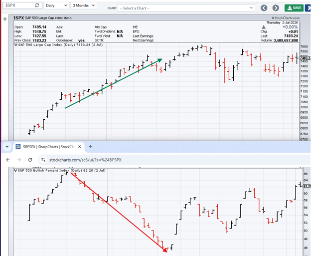
We see that while the market was continuing to go up, the breadth was dropping.
This could suggest that the market uptrend is not sustainable.
Sector Bullish Percent Indices
One of the most useful features of the BPI framework is that it extends to individual market sectors.
On StockCharts, typing “$BP” in the symbol search reveals BPI charts for all major sectors, including:
- $BPINFO — Information Technology
- $BPENER — Energy
- $BPHLTH — Health Care
- $BPFINA — Financials
- $BPINDU — Industrials
- $BPMATE — Materials
- $BPUTIL — Utilities
- $BPCONS — Consumer Staples
- $BPDISC — Consumer Discretionary
- $BPREAL — Real Estate
- $BPCOMU — Communication Services
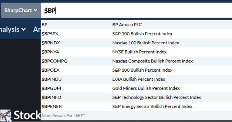
The sector BPIs allow a top-down approach: identify which sectors have rising BPIs (improving breadth) and focus trade selection on those sectors.
A sector BPI rising from below 30% is particularly compelling — it indicates that P&F buy signals are being generated broadly across the sector, which supports bullish options strategies on stocks within that sector.
Combined with the Nasdaq Dorsey Wright DALI report — which ranks asset classes and sectors by relative strength — the sector BPIs provide a breadth-based confirmation layer for the same top-down investment process.
How To Use The Bullish Percent Index In Practice
The BPI is most useful as a market condition filter rather than a precise timing tool.
Here’s how experienced traders typically apply it:
The 30/70 Framework
The most widely-used BPI rule is simple:
- Below 30%: Market is oversold. The majority of stocks have lost their P&F buy signals. Historically this is a contrarian buying zone — not because the decline is over, but because risk/reward has shifted in favour of buyers.
- Above 70%: Market is overbought. The majority of stocks are on P&F buy signals, meaning most of the upside has likely already been captured.
- 30–70%: Neutral zone. Neither condition gives a clear edge; trade based on individual stock setups rather than broad market direction.
The key refinement: what matters most is not the absolute level but the direction of change.
A BPI moving from 25% to 35% (rising from oversold) is a better buy signal than a BPI already sitting at 35% and falling.
Similarly, a BPI moving from 75% to 65% (falling from overbought) is more meaningful than one that’s been flat at 65%.
Column Signals on the BPI Chart Itself
Because the BPI is plotted as a P&F chart on StockCharts, it generates its own buy and sell signals.
When the BPI column of X’s exceeds the previous X column high — a double top breakout — it signals that market breadth is improving.
When it breaks to a new O low, it signals deteriorating breadth.
These signals on the BPI chart itself are often used as confirmation of entry or exit decisions on individual positions.
Using the BPI in Combination with Price
The BPI is most powerful when used in combination with the S&P 500 price chart.
The two primary signals:
- Bullish confirmation: S&P 500 making new highs AND BPI rising above 60–70%. Breadth confirms price — the rally has broad participation and is more likely to be sustained.
- Bearish divergence: S&P 500 making new highs while BPI is flat or falling. The rally is being driven by a narrowing group of stocks. This is the situation described in the divergence section above — and historically it has preceded meaningful corrections.
Using The BPI As An Options Income Filter
For options income traders running iron condors, credit spreads, and the wheel strategy, the BPI provides a simple, objective market condition filter:
BPI above 60% and rising — favourable for bullish income strategies. Bull put spreads, cash-secured puts, and the wheel can be positioned more aggressively (tighter strikes, larger size).
BPI between 40–60% — neutral market conditions. Standard sizing and positioning. No particular edge in either direction from breadth alone.
BPI below 40% or falling sharply from above 60% — reduce exposure. Widen iron condor call spreads, reduce overall position size, avoid new aggressive bullish positions until breadth stabilises.
BPI below 30% — contrarian opportunity zone. Not a signal to immediately buy, but to watch for P&F buy signals on individual stocks emerging from oversold breadth conditions. Bull put spreads on high-quality stocks with strong individual P&F signals can offer excellent risk/reward when the broad BPI is recovering from extreme lows.
This framework turns a macroeconomic breadth indicator into a practical position-sizing tool — something most options traders never think to apply.
Want to Build a Complete Market Analysis Framework for Options Income?
The BPI is one piece of a complete market analysis toolkit.
Options Income Mastery covers how to combine market breadth, implied volatility, and technical analysis to make disciplined, systematic options income trading decisions — with exact rules for when to trade, how much to size, and when to reduce exposure.
Learn more about Options Income Mastery →
FAQ
What Is A Good Reading For The Bullish Percent Index?
There is no single “good” reading — context matters more than the absolute level.
Generally, readings below 30% indicate oversold conditions and a historically favourable risk/reward for buyers.
Readings above 70% indicate overbought conditions where most of the upside has been captured.
The direction of change is often more important than the level: a BPI rising from 25% to 40% is a stronger buy signal than one that’s been sitting at 40% for months.
How Often Is The Bullish Percent Index Updated?
The BPI is updated daily on StockCharts based on the closing P&F chart signals for all 500 stocks in the index.
Because P&F charts filter out noise, the BPI doesn’t change as rapidly as price-based breadth indicators — it only shifts when a meaningful number of stocks generate new P&F buy or sell signals.
What Is The Difference Between The BPI And The Percentage Of Stocks Above The 50-Day Moving Average?
Both measure market breadth but from different angles.
The percentage of stocks above their 50-day moving average ($SPXA50R) uses a price-relative measure — it changes whenever a stock moves above or below that moving average, which can happen frequently with small price moves.
The BPI uses P&F buy signals, which require more sustained directional price movement to generate.
The BPI is therefore a slightly smoother, less noise-sensitive measure of breadth.
As shown in the article, both indicators generally agree — the BPI is simply built on P&F methodology rather than moving average analysis.
Can I Use The Sector BPIs To Pick Which Sectors To Trade?
Yes — this is one of their most practical applications.
Sectors with rising BPIs (particularly those recovering from below 30%) show improving breadth, which supports bullish options strategies on stocks within that sector.
Sectors with falling BPIs, especially those approaching or below 30%, indicate deteriorating breadth and are better avoided for new bullish positions.
Combining sector BPI analysis with relative strength rankings from tools like the Nasdaq Dorsey Wright Research Hub creates a robust top-down framework for options trade selection.
Is The Bullish Percent Index Available For Free?
Yes — the BPSPXchartandallsectorBPIcharts(BPINFO, $BPENER, etc.) are available for free on StockCharts without a subscription.
You can apply overlays like the 20-day moving average to the free chart as well.
Some advanced charting features or historical data may require a paid StockCharts subscription.
Conclusion
The Bullish Percent Index is a valuable addition to any market breadth toolkit.
Its foundation in Point-and-Figure analysis gives it a specific advantage: because P&F buy and sell signals are filtered for noise, the BPI represents genuine trend changes rather than short-term price fluctuations.
The 30/70 framework, the column signals on the BPI chart itself, and the divergence analysis between the BPI and the S&P 500 price chart are the three core applications.
Used together they provide a useful market condition filter — telling you whether current conditions favour aggressive positioning, cautious sizing, or selective avoidance of new bullish trades.
For most traders, the sector BPIs are where the most actionable signals are found — particularly when combined with the Nasdaq Dorsey Wright Research Hub’s relative strength rankings to identify the sectors where both breadth and momentum are aligned.
We hope you enjoyed this article on the Bullish Percent Index.
If you have any questions, please send an email or leave a comment below.
Trade safe!
Disclaimer: The information above is for educational purposes only and should not be treated as investment advice. The strategy presented would not be suitable for investors who are not familiar with exchange traded options. Any readers interested in this strategy should do their own research and seek advice from a licensed financial adviser.